Branding
Packaging
Passion Project
Surfs Up
Surf Shop in coastal california
challenge
Surf’s Up, a surf shop with a laid-back, retro “Sup, bro” vibe, is looking to increase surfboard sales and stand out in a competitive market. With plans to expand their business, they need a rebrand that captures their unique personality while appealing to a broader audience. The new brand identity must blend their nostalgic, carefree energy with a bold and modern edge, creating a memorable and authentic presence
Solution
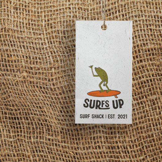
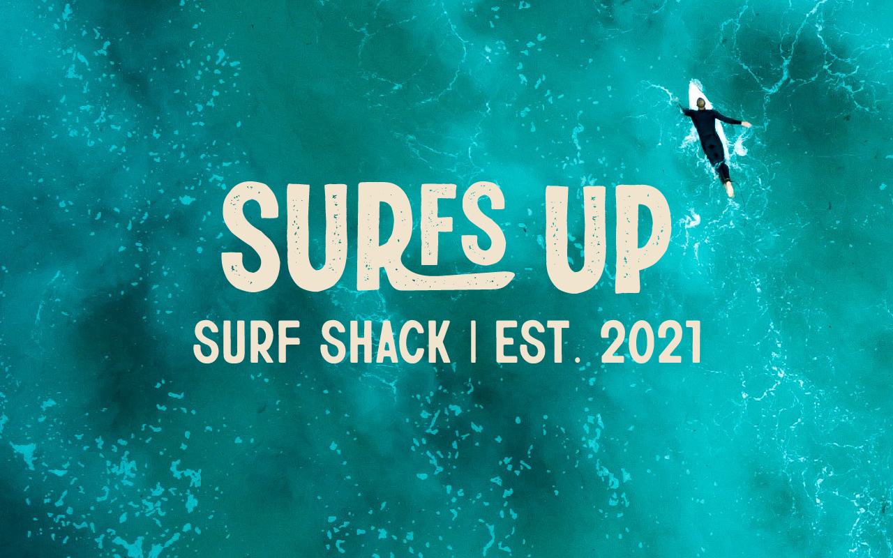
To capture Surf’s Up’s laid-back “Sup, bro” vibe, we designed a brandmark featuring a relaxed surfing frog, perfectly embodying the playful and approachable energy of the brand. The colour palette draws inspiration from the 70s, incorporating retro hues that evoke nostalgia and warmth. The simple yet impactful logo features textured elements to reinforce the vintage aesthetic, while the extended 'R' creates a dynamic visual effect, making the 'F' and 'S' appear as though they’re ‘surfing.’ Together, these elements create a cohesive and memorable brand identity that reflects the shop’s unique personality and sets it apart in the market.